What Is a Pitch Deck? (Examples and Best Practices)
Discover how to build a winning pitch deck with examples from the greats + reasons why most startup decks fail. Dive into our guide!
Dag Hendrik Lerdal

Do you know what giants like Uber, Facebook, Airbnb, and Intercom have in common? When they were fledgling companies, they secured funding using a pitch deck.
That’s why understanding how to create a winning pitch deck is key to a startup’s success.
In this article, we’re going to break down everything you need to know about pitch decks so you can reign in investors and get your company the funding it needs.
Pitch Decks Explained
At its core, a pitch deck is a collection of slides, typically between 10 and 20, that showcase your business plan to attract investors or secure VC funding.
A pitch deck shows:
- What problem your product solves
- How you plan to corner the market
- The key players on your team
- Financials and projections
- Your go-to-market strategy
The goal is to entice investors with this unique opportunity. However, it’s important to understand that it’s not about getting them to say “yes” at the end. It’s to avoid getting an outright “no.”
Remember, investors and VCs are constantly hounded by startups, so they have their own criteria they use to weed out the ones not worth their time and money.
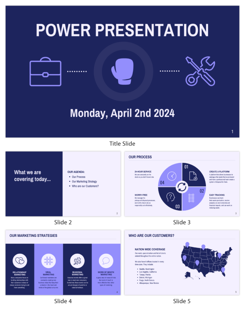
Your pitch deck needs to set you apart from the competition and get you through the initial round of evaluation. Venngage’s example below is a great pointer:
The Anatomy of a Pitch Deck
Of course, every startup and each investor/VC are unique – so no two pitch decks will be identical. However, there are some core elements they all share and points they should convey.
The basics of a pitch deck should include:
- Company introduction and overview
- Your company vision/mission
- The problem
- Your unique solution
- The market size
- Your business plan
- The customer
- The competition
- Proof of concept/market validation
- Financials and projections
- The team
- Funding requirement and allocation
Some slides can be swapped, but these are generally what investors want to see and know. If your pitch deck hits these key points, then you’re already on the right track.
How to Create a Pitch Deck
You have three options to use when you want to create a pitch deck, which include the following:
1. Traditional Tools for Creating Pitch Decks
PowerPoint is the OG pitch deck creator, where you can create static slides to cycle through. You can also use Google Slides to the same effect. While they are easy to use and Google Slides is free, they leave a lot to be desired in terms of customization options and integrations.
2. Use Pre-Built Pitch Deck Templates
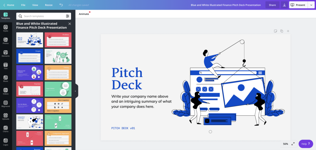
Another option is to use pre-built templates from tools like Canva or Visme. These work in a pinch, but they also lack any features to really help your pitch deck stand out. And while you can customize the templates, you still run the risk of having a cookie-cutter pitch deck. That’s why we recommend option three.
3. Dedicated Presentation Creators
With a dedicated presentation creator, you unlock the possibility of creating a dynamic and engaging pitch deck that really resonates with investors.
SlideDog, for example, lets you combine multiple media elements into a single playlist. This includes websites, videos, pictures, PowerPoint slides, and more to create a truly unique and compelling pitch deck to win investors over.

Why 99% of Pitch Decks Fail
Here’s a truth you need to understand: an overwhelming majority of pitch decks do not secure funding at 99%. It sucks to spend hundreds of hours and thousands of dollars preparing your pitch deck, only for another startup to get the funds instead.
Here are 4 key reasons we’ve seen pitch decks fail:
1. They Didn’t Tell a Story
Storytelling is a valuable skill, especially when looking to persuade someone to part with their money. Of course, you know your company’s vision and believe in its growth potential. But you need a story to help convey the message to investors.
The story you tell needs to create a narrative using real-life examples and social proof, data visualizations, and what sets your business apart from the rest. Remember, investors are looking for the next unicorn. They want to back visionaries and disruptors, so make sure your story shows how you can achieve that.
2. They Were Boring
Another trap startups fall into is creating bland and forgettable presentations. You want to create a pitch deck that is memorable by including clear and engaging information that’s visually appealing. That means you need to go beyond traditional presentation methods like PowerPoint.
Again, we recommend using SlideDog to create dynamic and aesthetically pleasing pitch decks to attract investors.
3. They Didn’t Adapt
One key factor that separates pitch deck successes and failures is tracking engagement and getting feedback to make improvements. You can’t get this type of data using traditional presentation tools.
This is another area where SlideDog shines. It features an interactive element that lets you get live audience feedback using an anonymous live polling.
This can help inform you on what’s working and what needs work. With this type of data on hand, you can give investors exactly what they’re looking for.
4. They Didn’t Answer Vital Questions
Your pitch deck needs to answer critical questions every investor will have. If you don’t, your pitch has failed before the first slide.
Some of the questions you should have clear answers for include the following:
- What’s the problem your solution solves?
- What’s your differentiating factor?
- What is your target market?
- What do you need funding for?
- What are the financial projections?
- What’s your GTM (go-to-market) strategy?
- Do you have a proven track record/proof of concept?
- What experience do you and your team have?
- What does the competitive landscape look like?
- What’s your business model?
Of course, you want the answers to the questions to pop up naturally through the story you’re telling. However, if you don’t have compelling answers to them, it’s less likely investors will believe in your dream.
So, when crafting your pitch deck, keep these questions at the forefront of your mind.
Pitch Deck Best Practices
1. Follow the “Less is More” Principle with Your Pitch Deck
Your pitch deck should be easy to read and understand at a glance. Avoid having large text blocks and keep things simple and sweet. Remember, investors are very busy and value their time – and you should, too.
Also, keep industry jargon to a minimum so it’s easy for investors to follow along. For example, if your company is SaaS, you don’t need to get into the nitty-gritty of your program’s backend and the technical aspects.
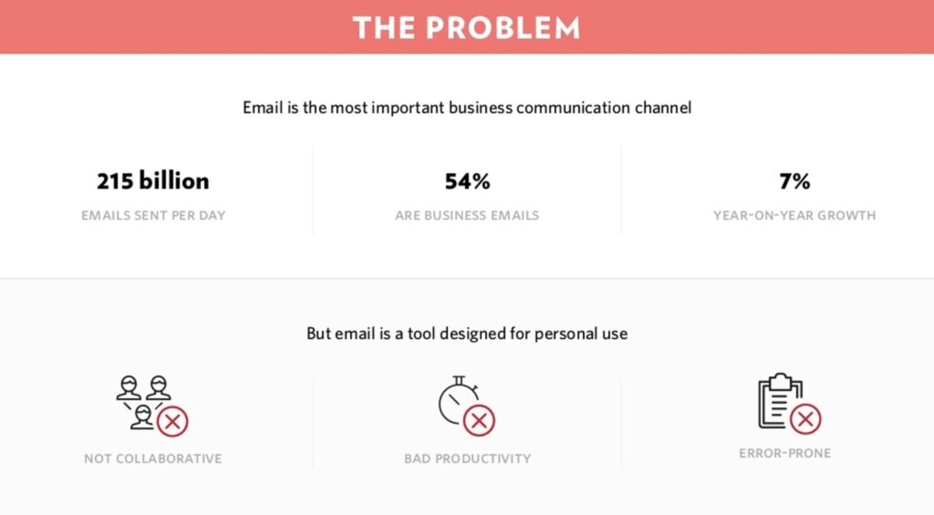
Use bullet points and short sentences to highlight key points you want to convey. Include visual aids like charts and graphs to help investors visualize metrics. All of these elements will help your pitch say much more while using less real estate on the screen.
2. Keep Your Brand Present Throughout the Pitch Deck
Use your brand color scheme, logo, font, and personality throughout your pitch deck to help keep your company in the back of investors’ minds during your presentation. All of these elements work together to create a cohesive pitch deck and make it more original and professional.
3. Include a CTA and Contact Details
Very rarely will an investor say “yes” right then and there. That’s why your pitch deck should include a CTA (or call to action) that guides investors on what to do next.
You will also want to include contact information so they can get in touch when they’re ready to move forward.
The last thing you want is to create a winning pitch deck, present it to investors, and wow them, but they don’t have any way to reach out. That’s money you could be potentially leaving on the table.
5 Examples of Great Pitch Decks
1. AirBnB's Pitch Deck
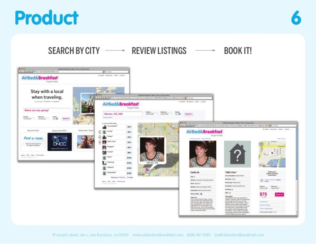
In 2008, Airbnb used this pitch deck to secure $600,000 from Sequoia Capital. Airbnb is a unicorn company that completely transformed the short-term rental and hospitality industry. Since its inception, Airbnb has grown to a market cap of over $80 billion.
The important slide to pick out from Airbnb’s pitch is the business model slide, which shows how they plan to generate revenue. For every transaction on the platform, Airbnb takes a 10% cut. We also like the simplicity of the problem slide, where they lay out the mark issues in 3 easy-to-understand points.
If you’re looking for a template to build your pitch deck around, you can’t go wrong with this one.
2. Facebook's Pitch Deck

Another behemoth that shows the power of a pitch deck is Facebook (now called Meta). Founded in 2004 by Eduardo Saverin and Mark Zuckerberg, they put together a pitch deck/media kit that showed Facebook’s value proposition and key metrics.
Since Facebook wasn’t making money at the time, they focused more on their user engagement and growth potential. This approach was good enough to net Facebook over $2 billion in funding before its IPO.
One thing we’d like to point out is Facebook’s pitch deck doesn’t have a “problem” slide. That’s because Facebook was in a unique position since it catered to university and college students who wanted to connect in the digital age.
3. Uber's Pitch Deck
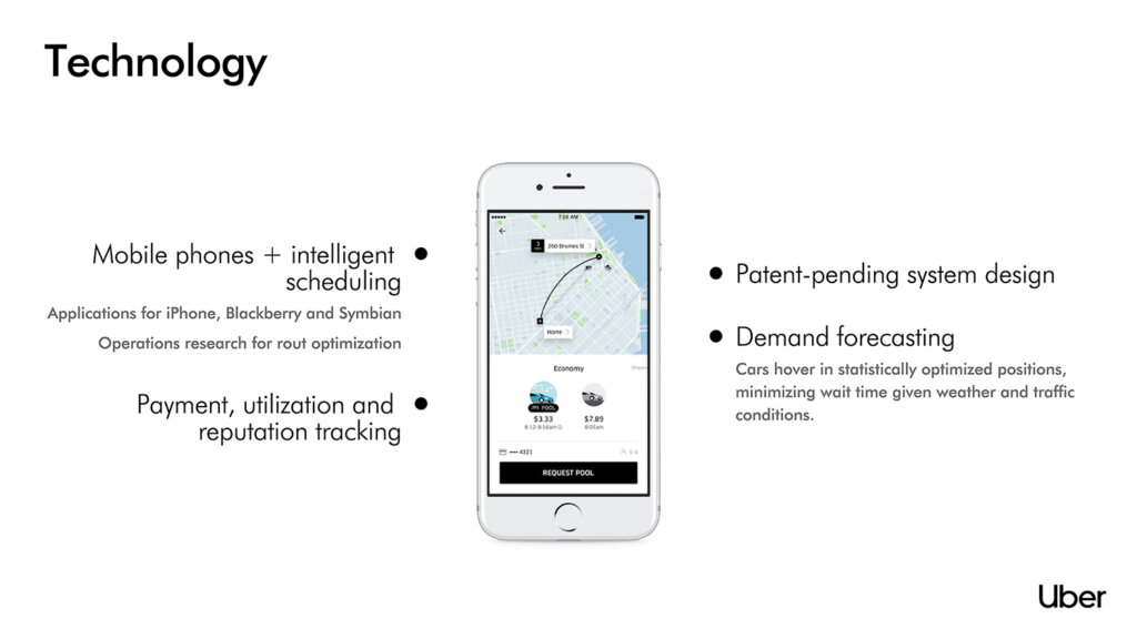
Back when it was called UberCab, Uber founders created their winning pitch deck in 2008 to secure around $25 billion before IPO. It was a simple idea: an app that calls you a cab within just a few minutes. No more standing on the side of the street with your hand out to hail a cab.
What we like about Uber’s pitch deck is how it accurately conveys how it can disrupt the taxi industry forever. Information is displayed visually, using objects and simple, short copy.
And it’s kept good on the promise now that Uber is available in over 70 countries worldwide.
4. WeWork's Pitch Deck
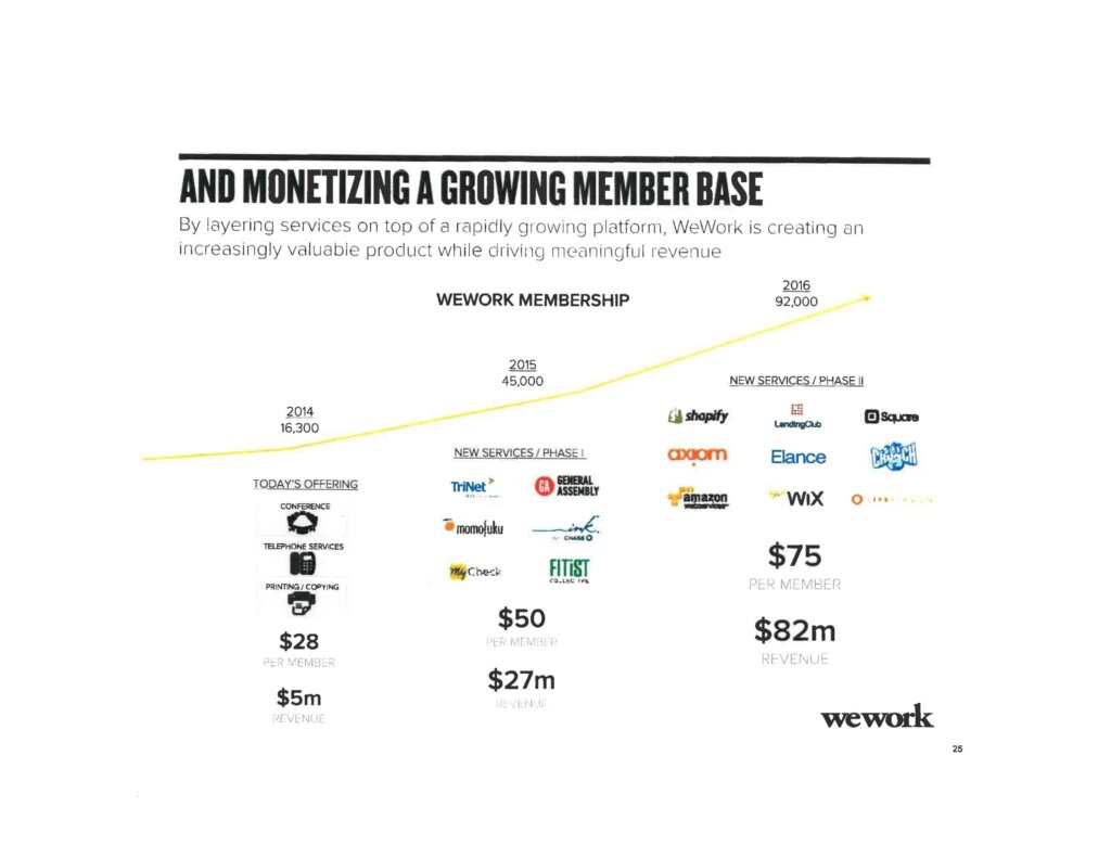
Although it’s fallen from grace, we’d be remiss if we didn’t include WeWork’s pitch deck that helped them secure over $1 billion in funding based on a $10 billion valuation. Taking a page from Uber and Airbnb, WeWork sought to transform the way we work in the digital age by offering state-of-the-art co-working spaces for a monthly cost.
WeWork relied heavily on data, projections, and visual aids to showcase the potential of their business plan. Of course, it also helped they were able to partner with big companies like Coca-Cola through an affiliate scheme.
However, it’s clear WeWork founders were confident in their business model and weren’t afraid to show it. So, if you know you’ve got a great business plan and grow with the right support behind it, let it show in your pitch deck.
5. Intercom's Pitch Deck
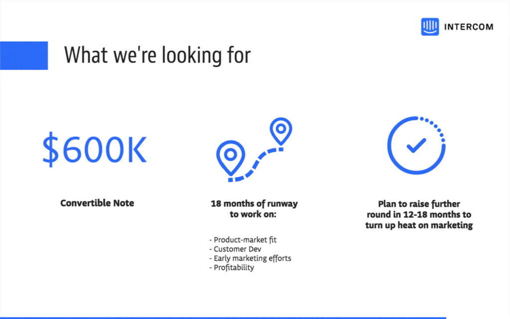
Founded in 2011, Intercom is one of the biggest players in the business communications space. And their amazing pitch deck is one of the reasons they were able to grow to be so massive.
One thing to note about this deck is how the Intercom is ever-present throughout the pitch. The bullet point font and calm, blue background add a bit of personality that helped Intercom stick out investors’ minds.
Another thing to point out is their pitch deck is only 8 slides. Remember, you don’t need to overload your audience with information. Keep your pitch deck to the most pertinent info to make it more impactful.
Let SlideDog Help Your Pitch Deck Win!
Pitch decks are a powerful tool in your arsenal for helping your business grow.
However, you need to make sure it’s visually appealing while also containing the key information investors need to undersand your vision and make a decision.
With SlideDog on your side, you can be confident that when you’re presenting your pitch deck, you’re giving it the best chance for success. Sign up for SlideDog today to take advantage of everything we have to offer and take your presentations to the next level.

