12 Tips to Build a Dreamy PowerPoint Presentation
If you feel like your PowerPoint presentations are just okay, and you want them to do more, you’ve come to the right place! In this article, I’ll share some of my own and SlideDog users’ best tips for fantastic PowerPoint presentations. Let’s kick things up a notch!
Dag Hendrik Lerdal

If you feel like your PowerPoint presentations are just okay, and you want them to do more, you’ve come to the right place!
In this article, I’ll share some of my own and SlideDog users’ best tips for fantastic PowerPoint presentations. Let’s kick things up a notch!
1. Don’t Skimp out on the PowerPoint Presentation Design
They say not to judge a book by its cover – but we all do it anyway.
A well-designed presentation gives your presence credibility and your message the gravitas needed to capture attention, especially if you deal with audiences that frequently scroll on their phones or multi-task while listening to you.
Your slides should be visually appealing, with a clean and professional design. Avoid cluttering your slides with too much text or images, and use white space strategically to make your content easier to digest.

Remember, simplicity is key! The design of your slides should complement your content and not overshadow it.
Choose a theme or template that aligns with your brand or topic and stick to it throughout your presentation, so the audience associates you with a specific look and feel (AKA: visual identity) and creates a clean framework for content delivery.
Lastly, make sure your slides are easy to read. Use legible fonts (e.g., Arial, Calibri, Roboto) and readable font sizes. No decorative fonts, please! They belong in graphics – not PowerPoint presentations.
Similarly, choose colors with good contrast so your audience doesn’t have to squint.
2. All Eyes on the Prize
The design work doesn’t begin the moment you boot up PowerPoint. It starts way before – when researching your audience:
- Who are you presenting to?
- What are their expectations, interests, and knowledge levels?
- What does their current situation look like? Where will you take them? (Before and after)
- Are you trying to inform, persuade, or inspire them?
Once you have a clear understanding of your message, it’s much easier to create a presentation that drives your point home.
The same goes for understanding your audience’s tone and pain points.
For example, if you know you’re talking to overworked operations managers who just want to get out of the spreadsheet hell, you can build a presentation that convincingly shows them how your solution will take them from point A to where they want to be.
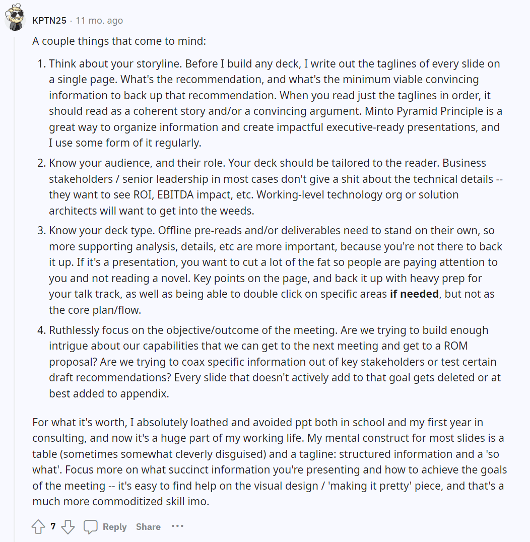
3. Build Your PowerPoint Presentation with the Narrative Flow in Mind [Cheatsheet]
Some of the worst presentations I’ve seen were bad because of one simple, easily preventable reason: the presenters constantly had to catch up with the presentation and cut themselves off from finishing their point.
It felt like the presentation was in the driver’s seat – not the presenter.
So, instead, make sure your presentation has a logical flow that guides the audience through what you have to say in a way that makes sense.
If you’re the type who likes to ad-lib presentations depending on the audience’s sentiment, go with a minimal structure that gives you plenty of free room to experiment.
On the other hand, if you have a script in your head, create a PowerPoint presentation that supports it with the key facts and figures.
PowerPoint Presentation Structure Cheatsheet
- Introduction: Start with a captivating opening and introduce the topic. Make it clear what the purpose of your presentation is and what the audience will learn by the end of it. For example, a sales presentation that introduces the audience to how you’ve previously helped customers simplify their spreadsheets and increase productivity.
- Agenda: Discuss the key points you’ll cover during the presentation. If it’s a smaller presentation, ask the audience if they’d like to put anything on the agenda.
- Body: Divide it into logical sections or topics with plenty of realistic examples and relevant information. Keep things concise to maintain the audience’s attention because the body of the presentation is where you’ll usually end up losing them.
- Transition Slides: Smoothly guide your audience from one section to another.
- Conclusion: Wrap up your presentation by summarizing the main points and reinforcing your key message. End with a strong closing statement or call to action. The goal is always to answer: “Alright, what should I do with this information?”
4. Reverse-Engineer Your PowerPoint Presentation
Usually, we tend to create presentations linearly. However, when you reverse-engineer your presentation with “backwards design,” you start with the end goals or outcomes in mind and then work backward to design your presentation.
You first identify the key messages you want the audience to remember and then structure your presentation around these core points.
For example, if your learning objective is to educate your team about a new project, your key takeaways might include project goals, timeline, and team roles. Knowing that, each major section or slide needs to correspond to one of your key messages. For each key takeaway, you will provide supporting evidence, examples, or anecdotes that illustrate and reinforce your point.
Backwards design is the best way to make sure you’re not floundering through your presentation, but keeping it focused on what your audience needs to know.
5. Use Multimedia Formats
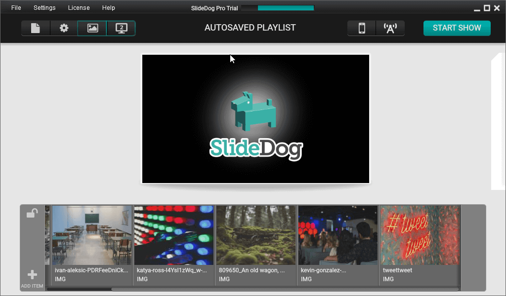
Don’t settle for animations. Instead, spice up your PowerPoint presentations with SlideDog.
SlideDog allows you to combine multiple file formats (PPT, Prezi, images, videos, web pages, interactive features) and build a presentation playlist that works exactly like your PowerPoint, but offers more ways to engage.
Instead of going through the presentation slide-by-slide, create a playlist that incorporates things like:
- Your prospects’ websites when suggesting changes and giving feedback.
- Videos with testimonials.
- Exciting, narrative-driven Prezi slides.
- Your standard PowerPoint deck.
All this will turn your presentation into an experience – not just another commitment the audience has to sit through!
6. Try Telling a Story with Your PowerPoint Presentation
As humans, we find stories to be biochemically rewarding. We love to go on a journey where a protagonist like us goes on a fantastic quest for the prize. Of course, there are ups and downs – but that’s what your presentation is here for.
Structure your presentation as a narrative with a clear beginning, middle, and end.
You can use anecdotes, examples, or case studies to illustrate your points and stir emotions.
Again, do you remember my ops example? Build a tangible before-and-after image that your audience can hold in their minds. It will reinforce your point while making the presentation enjoyable.
Don’t resort to cliches – instead, find a representative of your audience and build a story around their ups and downs.
Remember: we don’t buy rationally. We buy with emotions, and we rationalize our decisions later.
Need some inspiration? I’m a big fan of the Analyst Academy, who frequently break down why some presentations look more awesome than others!
7. Deliver Your PowerPoint Presentation with Confidence
You can have the prettiest PowerPoint presentation in the world, but if you don’t believe in what you’re saying – or in yourself – it’ll be hard to convince the audience.
Now, I know we’re not all born salespeople, but there are a few confidence tricks you can use:
- Prepare and rehearse ahead of time so you always know what’s coming next.
- Record yourself while holding a dummy presentation to identify any areas for improvement. (Don’t let it get you down, though! It’s normal to need to improve. Rome wasn’t built in a day, either.)
- Build rapport with your audience. Before you get into the thick of it, take a few minutes to establish a connection with the listeners. Use eye contact, ask questions, encourage participation, and invite feedback. You can also try an icebreaker question or a joke.
- Pace yourself. Pay attention to your voice modulation and pace. When we’re nervous, we tend to speak faster and breathier. Take deep breaths before the presentation and visualize yourself moving smoothly through it without rushing through things.
- Use inviting body language. Stand tall, smile, keep an open posture, and use natural gestures to emphasize your points. Try to think like you’re talking to just one person, even if you’re presenting to an audience of hundreds.
- Stay calm, even if there are glitches or interruptions. They’re normal, especially with online presentations, so don’t let that get you out of your zone. Have a backup plan prepared.
In most cases, preparation is vital to feeling more confident. Have a plan B for anything that could go wrong, and you’ll be golden!
8. Stick to the Script (but not too much)
If you’re delivering a presentation to a big audience, you’ll naturally need to stick closer to the script and have a structured Q&A time.
However, if you’re delivering a sales presentation or working with a smaller group, leave some room for flexibility.
Don’t be the presenter who pushes the audience to stop asking questions because they have a script to deliver. Instead, allow for some digressions and gently steer things back to the main topic.
Once you start feeling more comfortable, you can use your PowerPoint presentations solely as background guides or as ways to enrich the presentation while your narrative does most of the legwork.
9. Involve the Audience in Your PowerPoint Presentation
Presentations are a lot like cold calls – your goal is to break the pattern to get someone’s attention on you. Since most people have gotten used to being on the passive receiving end of a presentation, it’s a good idea to shake things up and include them.
Start by asking questions. For example, in a presentation about team collaboration, you could ask, “What are some challenges you’ve faced when working in teams, and how did you overcome them?”
Then, poll the audience on their opinions or preferences on relevant topics. For instance, in a marketing presentation, you could ask, “Which social media platform do you think is most effective for reaching our target audience?”
(Make sure you have a plan in case the overwhelming majority doesn’t agree with your hypothesis.)
You can also create a quiz. Offer multiple-choice questions or true/false statements related to your topic. This is much easier if you already have the PowerPoint presentation set up for it, but it can be as simple as displaying the questions and asking the audience to raise their hands based on what they think is correct.
(Bonus points if it’s something unexpected!)
Of course, if you have training presentations, things can get much more interactive. For example, you could introduce role-plays, teamwork, and gamification.
10. Get Rid of Stock Photos
Stock photos are a one-way street to Bore Town, especially if you use the stereotypical ones.
Instead, test hand-drawn slides, jokes, or even memes.
I can’t count all the times a meme provoked a positive response from the audience, as opposed to a generic stock photo.
11. Try the PechaKucha Format for Your PowerPoint Presentations
When you hold a PechaKucha presentation, you’re giving 20 seconds to each of the 20 slides. This is a good way to keep things moving, although you don’t have to commit to it the whole way through.
Instead, use the PechaKucha presentation to make a point when your audience’s engagement drops off and get their juices pumpin’!
If you use SlideDog for your multimedia presentations, use the auto-advance feature. With it, you’ll easily create a PechaKucha presentation with 20 high-res images.
12. Use Unexpected Metaphors
The more unexpected, the better!
For example, you might compare compound interest in a presentation to a snowball effect. You might compare encryption to secret codes.
Or you might go wild and find something that Game of Thrones and automation software have in common.
The world is your oyster!
Critical Mistakes to Avoid in PowerPoint Presentations
What would our post be without a list of things you should avoid when creating your slides?
Here are the key mistakes I see people making all the time, which are costing them attention (and revenue):
- Too Much Text: Don’t overload your slides with text. Yes, I know it’s important. No, that doesn’t mean all of it needs to be on the slide. Use visuals, keywords, and narration to support your message instead.
- Overusing Animations: Animations are fun, but if used too much, they can make you look unprofessional.
- Be careful with the “Random” slide transition effects. Animations are fine when used sparingly, but if your whole deck has random transitions, your presentation will start looking unprofessional fast.
- No Visual Hierarchy: If your slides are all over the place with no clear headings and order, you’ll lose attention fast.
- Reading Slides Word-for-Word: Use your slides as visual aids; don’t rely on them to provide you with the talk track.
Ready to Create Better Presentations?
Rome wasn’t built in a day, but your presentation can be. If you keep the tips I shared with you in mind, or at least test them once in a while, you’ll see a significant improvement in the way both you and your audience perceive the presentations.
A good first step is reviewing your existing presentation style. What do you need to improve? Start with that, then keep adding the building blocks until you’ve built a veritable presentation castle!
And when you get bored of PowerPoint-only presentations, join us here at SlideDog. We’ve got multimedia presentations that’ll keep your audience glued to their seats! (And a handy free version.)


